
Basic Landing Page Designs That Will Last Forever

Landing pages can have many purposes, but they do two things exceptionally well — gathering customer information and capturing leads. However, they’re not that easy to get right, and designing a landing page that drives revenue is as much an art as a science.
This is why we got our friends from a leading New York web design company for examples of the best landing pages out there, including expert analysis on why each of them converts.
Of course, even with all this information, creating a landing page will not be a walk in the park. It will probably require at least some A/B testing and switching out ideas as your brand grows. However, once you have the fundamentals figured out, the backbone of your landing page will serve you well for a long time.
8 Top Landing Page Designs to Use for Inspiration
If you want to increase your conversion rates by spicing up your landing pages, this list should help you out. Check out these eight real-world examples of great landing pages!
Winc
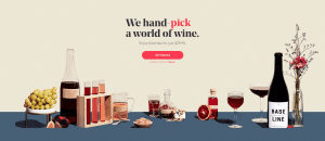
Powerful visuals can be a massive asset to your landing page. This example shows how you can keep things relatively simple and still highlight calls to action and important words with striking colors.
The idea is to strike a balance between capturing your targeted audience’s attention and using colors that correspond with your brand identity.
Rover
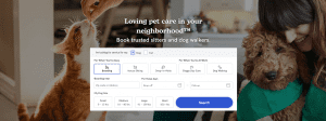
There’s no need to overwhelm your visitors with a ton of information on a landing page. As this example from Rover shows, it is often much wiser to get straight to the point.
Being clear and concise and getting your audience to what they’re looking for quickly reduces the odds of them becoming distracted and failing to take the desired action.
FabFitFun
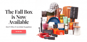
Customers like to know exactly what they’ll get if they order a given product. And nowhere does this ring truer than with gift boxes, which often include more than a dozen items.
This landing page by FabFitFun is an excellent example of how to eliminate apprehensions and concerns in your prospects. Simply show them everything they’re getting.
HelloFresh

HelloFresh gives us a great example of the well-known rule of web copy — focus on benefits rather than features.
The page also states what exactly HelloFresh does, but the emphasis is on the “Cooking as Easy as Eating” tagline, which clearly describes the benefits users get from the service.
Nauto
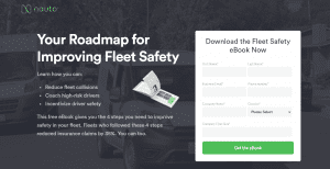
Sometimes the benefits a brand offers are not so easy to describe — they may be highly technical or too broad to cover in a single landing page. Nauto came up with a clever way to get around this problem and generate qualified leads in the process.
The company offers an AI product designed to improve road safety in fleet vehicles. It overcame the challenge of promoting its somewhat complex product by offering visitors a free ebook that describes the product thoroughly. All the reader needs to do is enter some information, and voila, you’ve got yourself a lead!
PokemonGO
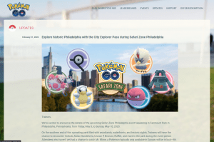
Now, here’s a page that goes against everything you know about landing-page best practices. As we all know, simplicity is key to an effective landing page. So, what are we doing showing you an example of a blog post?
Like pretty much every rule in the world, this one has exceptions, and this example shows one. There are situations when long-form content is preferable on a landing page, such as when it introduces users to a new product or service.
Starry
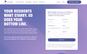
Back to textbook examples. This landing page works because it focuses on convenience as the product’s primary benefit. The copy and headline are both short and get to the point quickly, yet specific enough to show the user that the product will solve their problem.
Striking this balance when writing landing page copy should always be your goal.
Hootsuite
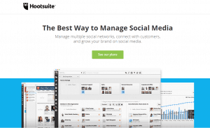
A picture is worth a thousand words, and Hootsuite’s landing page demonstrates this perfectly. If your product serves multiple purposes, sometimes the best way to present them all is to use a simple image.
This way, you can depict all of your product’s functions without overwhelming your visitor with too much unnecessary information and mountains of content.
5 Landing Page Best Practices for 2021
Examples of great landing pages can only get you so far. Therefore, we’ve also decided to create a shortlist of the best landing page design practices to help you achieve your goals.
Focus on the Benefits
We already mentioned this best practice briefly when we talked about HelloFresh’s excellent landing page, but it is worth mentioning again.
The bottom line is that your audience does not care how much you invested in your materials and whether you’ve overhauled your product in every conceivable manner. They care only about what these changes will do for them.
Don’t sell the product — sell what the product offers to the customer.
Create High-Quality Copy
Most online copy is dull and iterative. This may sound horrible, but it is actually great news for you, as you can stand out from the crowd by simply doing something different. When writing ad copy, make sure to pull the reader in.
Before you can do this, you need to understand that readers are not interested in marketing copy. Instead, they want to learn what a product or service can do for them (sound familiar?).
Don’t settle for the boring copy that you see on every other landing page in your niche. Just because your competitors are doing it doesn’t mean it’s the right approach. Going the extra mile with your copy is guaranteed to have a massive impact on your conversion rates.
Use Responsive Web Design
Nowadays, more people access the internet through their phones than their computers, and they expect to have an equally good, if not better, experience.
The days when internet users were okay with horizontal scrolling and pinching to zoom are long gone. Now, your content needs to be equally readable across a wide range of devices. This means your buttons need to be the right size for your visitor’s fingers, your fonts need to be big enough to read, and your images need to adjust to the size of the screen.
Invest in SEO
Most landing pages are created with an expiry date. Once a promotion or sale ends, it is time for its respective landing page to fade into obscurity. However, that does not always need to be the case.
Some promotional landing pages and SEO Tips That Will Improve Your Web Design are used more than once. You can use those landing pages repeatedly if you do an annual Black Friday sale or a monthly giveaway. In this case, you want to optimize these pages for search, as it can help you organically generate qualified traffic.
Wrapping Up
Each of the landing pages shown in this post is unique, but they share common traits and practices that help them drive conversions.
Even though your products may differ from those highlighted above, the examples and best practices outlined here should help you design a top-notch landing page for your website and significantly increase sales.


